This particular study has been covered widely in the press. From The Washington Post (“Massive randomized study is proof that surgical masks limit coronavirus spread, authors say”):
“‘I think this should basically end any scientific debate about whether masks can be effective in combating covid at the populationlevel,’ Jason Abaluck, an economist at Yale who helped lead the study, said in an interview, calling it ‘a nail in the coffin’ of the arguments against masks.”
Similar levels of praise have appeared in Nature (“Face masks for COVID pass their largest test yet”), the Stanford Medicine News Center (“Surgical masks reduce COVID-19 spread, large-scale study shows”), and Live Science (“Huge, gold-standard study shows unequivocally that surgical masks work to reduce coronavirus spread”). Of course, none of the journalists covering this study have actually read it. But you should, and this article will help you to do so.
Note: I’ve tried not to read what anyone else on the Internet has written about these studies, butthis one is well-known enough that it’s hard to avoid discussion of it. At some point I gave up and allowed myself to read multiple responses to the study. I’ve been influenced by the following sources:
However, most of the research in this article is my own, based on my own analysis of the study data, and I suspect this article is the most comprehensive discussion of the Bangladesh mask study you will find anywhere.
Here is all the data and code I used to make the graphs in this article (if you have trouble extracting this archive, you may need to first rename it to “01_data.zip”):
I aim to make this article as accessible as possible. I will start from the basics and assume no knowledge of statistics or clinical study design. The purpose of this series is to be educational, and you are welcome to come to different conclusions than I have.
1. Broad overview
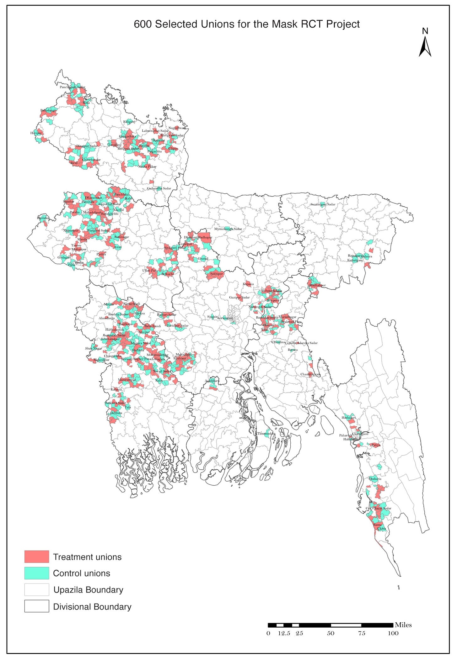
The study authors selected 342,183 individuals in 600 villages in rural Bangladesh. Using a randomized process, half of the villages (300) were assigned to the intervention groupand half of them (300) were assigned to the control group. From the paper:
“All intervention arms [i.e. villages in the intervention group] received free masks, information on the importance of masking, role modeling by community leaders, and in-person reminders for 8 weeks. The control group did not receive any interventions.”
The goal of the experiment was to determine whether the intervention (the full package of the free masks, the information, the role modeling, and the reminders) had any effect on COVID-19 outcomes.
The Bangladesh mask study is an example of a randomized controlled trial (or randomized clinical trial, or RCT):
“Randomized” because villages were randomly chosen to receive the intervention, rather than choosing whether or not to implement it. Randomization can eliminate bias, but only if it’s done properly.
“Controlled” because there was a control group that received no intervention at all. The control group gives us an idea of what would have happened without the intervention.
Large RCT’s such as this one are generally considered to be the gold standard for clinical evidence. They are the best way to separate the effects of the intervention from what would have happened anyway. But that doesn’t mean it’s impossible to mess up an RCT.
The study had several endpoints: clinical outcomes that can be measured in the control and intervention groups to evaluate whether the intervention had any effect.The primary endpoint was symptomaticseropositivity. An individual was said to be symptomatically seropositive if they met all three of the following conditions:
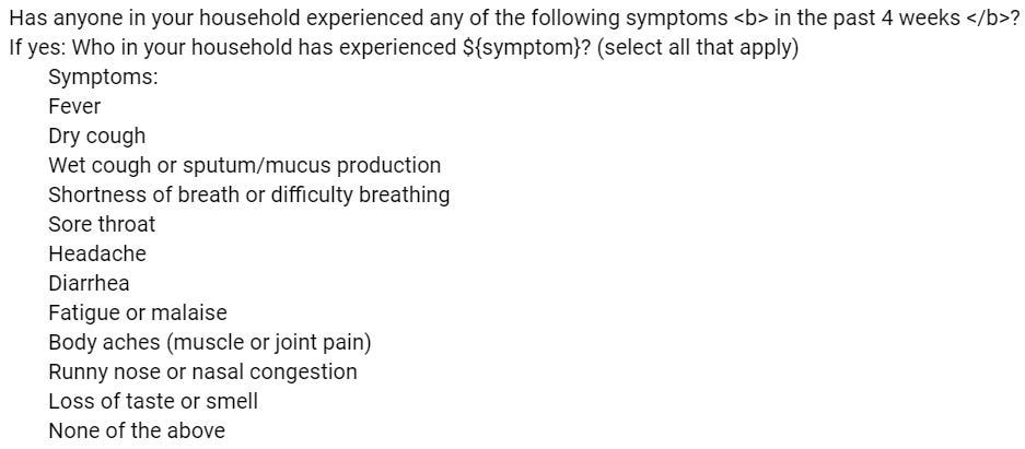
They exhibited COVID-19 symptoms, as determined by a survey which you can read here.
They consented to blood collection at endline (that is, at the end of the study period).
IgG antibodies against SARS-CoV-2 were detected in their blood serum. (IgG antibodies are produced by the immune system of an infected person. They usually remain detectable for months to a year after a symptomatic infection.1)
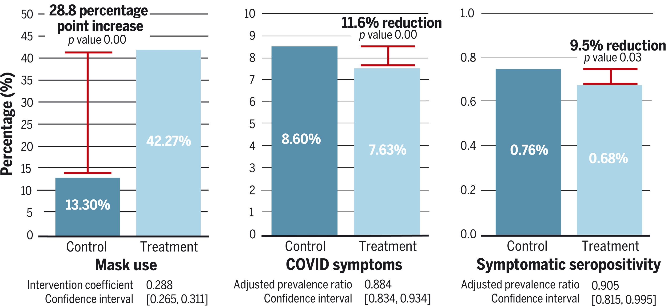
Looking at the right side of the figure above, we see that 0.76% of individuals in the control group were symptomatically seropositive, and only 0.68% of individuals in the intervention group were symptomatically seropositive. So the intervention appears to have reduced rates of symptomatic seropositivity by 0.76% - 0.68% = 0.07%. (Not 0.08%, because of differences in rounding.)
A closer look: Absolute risk reduction vs. relative risk reduction
The 0.07% figure we just calculated is called the absolute risk reduction. As you can see, it is simply the rate of symptomatic seropositivity in the control group, minus the rate of symptomatic seropositivity in the intervention group. The absolute risk reduction answers the question: “If we apply the intervention to 100 people, how many cases of symptomatic seropositivity will be averted, on average?” The answer (ignoring, for now, any problems with the methodology of the study) is 0.07.
In contrast, the “9.5% reduction” shown in the picture above is called the relative risk reduction. It is equal to the absolute risk reduction, divided by the rate of symptomatic seropositivity in the control group: 0.07% / 0.76% = 0.095 = 9.5%. The relative risk reduction answers the question: “In 100 random cases of symptomatic seropositivity, how many of them could have been averted by applying the intervention, on average?” The answer (again, ignoring any methodological problems) is 9.5.
Here is an illustration of the distinction between absolute risk reduction and relative risk reduction, though I think the author’s claim that “absolute risk = much better” is an oversimplification:
In the example above, the cancer drug has a relative risk reduction of 50% and an absolute risk reduction of 0.1%. So out of 100 random cancer patients, 50 of them on average could have been prevented from getting cancer by administering the drug. On the other hand, giving the drug to 100 random patients will avert cancer in only 0.1 of them on average.
The relative risk reduction is always greater than the absolute risk reduction, so researchers who wish to make an intervention seem effective will often focus on the relative risk reduction. This is not in itself a misleading practice, but it is easy to be caught off-guard if you are not aware of it.
Symptomatic seropositivity is not the only endpoint that the authors use to argue that the intervention was successful. Looking at the center of the figure above, we see that 8.60% of individuals in the control group exhibited COVID symptoms, but only 7.63% of individuals in the intervention group exhibited COVID symptoms. So the intervention also appears to have reduced the rate of COVID symptoms by 8.60% - 7.63% = 0.94%.
The key word here is “appears”.
2. What are the issues?
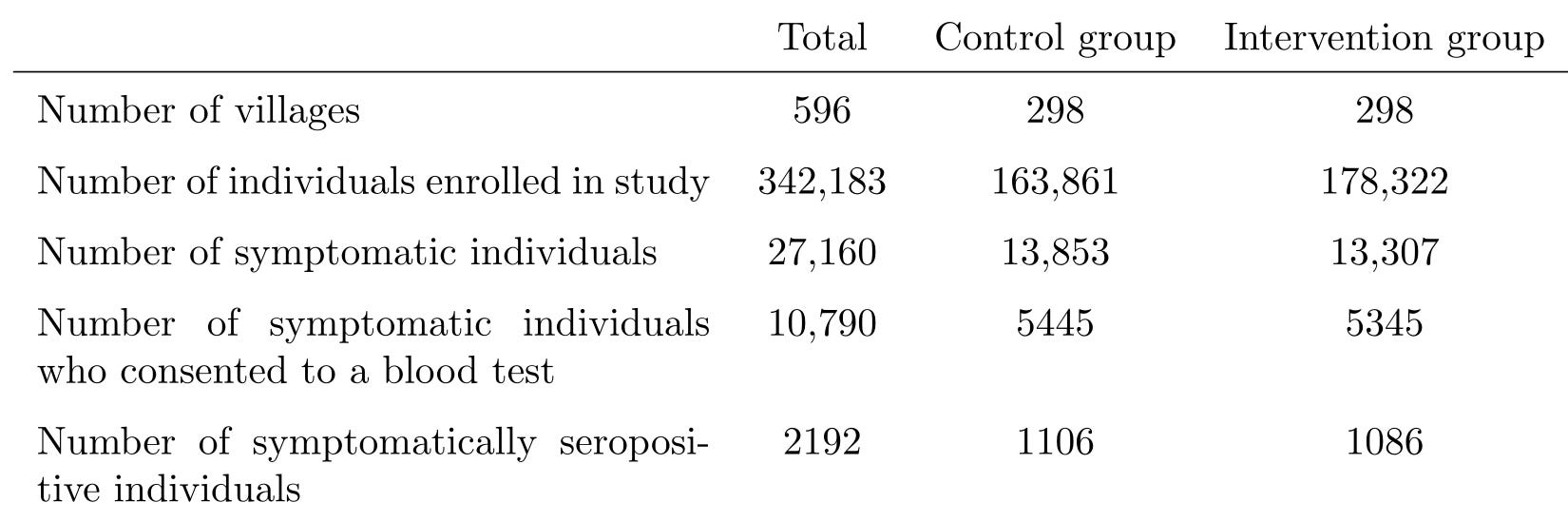
Here is a table that summarizes what we’ve discussed so far.
Some clarifications:
Four villages were dropped from the study before the intervention began “owing to a lack of local government cooperation”. That is why this table lists 596 villages instead of 600.
Most of the numbers in this table do not appear in the paper, and can only be found in the supplementary appendix. The supplementary appendix is a researcher’s favorite place to hide “inconvenient” information, and you should always read it.
Some of the numbers in this table don’t even appear in the supplementary appendix, and can only be found by asking your friend (If you’re reading this, thank you!), who has access to the $1,000 statistics software that the authors used, to clean the data from the study and send it to you in an analysis-friendly format. I am referring to the numbers in the last row, which you’d think would be important enough to include in the paper, given that symptomatic seropositivity is the primary endpoint of the study, but I digress.2
Some of the numbers in this table disagree with numbers in the paper. For example, according to the table, the symptom rate in the control group was 13,853 / 163,861 = 8.45%, as opposed to the 8.60% listed in the paper. The reason for this discrepancy is that most (but confusingly, not all) of the numbers in the paper come from a different analysis of the data, which excludes 24 additional villages. I do not think that the exclusion of those villages affects anything I’m going to say below, and I will choose not to exclude them in my own analysis where possible.
Why do I think it would be foolish to conclude from this assortment of results that masks reduce the spread of COVID-19?
Before I show you the reasons, I should point out that the effect size of the intervention was small. The absolute risk reduction in symptomatic seropositivity between the control group and the intervention group was 0.07%. The absolute risk reduction in symptoms was 0.94%. So as I explain each flaw of this study, you should ask yourself “can this flaw explain a 0.07% difference in symptomatic seropositivity or a 0.94% difference in symptom rate”? If you answer “yes” even a single time, then this study is not the “nail in the coffin” that Dr. Abaluck claims it is. If you answer “yes” multiple times, then the results of this study are essentially meaningless.
2(a). What is this “intervention”, anyway?
Abaluck et al. contend that the intervention villages had lower rates of COVID-19 symptoms and symptomatic seropositivity because they had higher levels of mask-wearing. But could the cause have been something else?
The intervention applied was incredibly complex. It had at least the following components (and you can verify all of this in the intervention protocol).
In some intervention villages, a series of biweekly text messages, such as
“Loving parents wear their masks to protect their children. [break] Are you wearing your mask today?”
“We come close to others at markets, and may give each other the virus. Remember to wear your mask when you go shopping!”
“Everyone should wear a mask to keep us safe. Will you wear a mask when you go out today?”
In some intervention villages, providing individuals with signs that declare “This is a mask-wearing household” and encouraging them to post the signs on their door
In some intervention villages, monetary or other rewards for having mask wearing levels of 75% or more
This is a complete failure to isolate the effects of mask-wearing. We have no idea whether it was the masks that caused the decrease in reported COVID-19 symptoms and symptomatic seropositivity or whether it was any one of the other myriad aspects of the intervention.
For example, surveillance staff also measured the level of physical distancing at each village. The rate of physical distancing in the intervention group was 29.2%, significantly higher than the 24.1% observed in the control group. But we would never come to the conclusion that “masks cause higher levels of physical distancing”. More likely, it was the intervention that caused both mask-wearing and physical distancing.4 Why, then, are we comfortable coming to the conclusion that “masks cause lower levels of symptomatic COVID”?
Now, this is a obvious gaping hole in the methodology of the study, and as such I am certainly not the first one to point it out. The most common attempt to patch this hole usually goes as follows:
Dr. MacLaren says that it doesn’t matter whether or not it was the masking, per se, that caused the decrease in reported COVID-19 symptoms. I am allergic to this kind of unscientific willful ignorance. What if the intervention group only had lower symptom rates because the intervention encouraged hand washing, and it had nothing to do with the masks? What if it was simply because the people in the intervention villages were more aware of COVID and knew to stay home if they were sick? Isn’t that something we should know, but have absolutely no way of knowing from the results of the study?
A closer look: But what about the regression?
The authors attempted to get around this issue by running a regression analysis, which appears in Appendix O. Specifically, for each village, they recorded:
the change in mask wearing from baseline (that is, the fraction of people observed wearing masks during the intervention, minus the fraction of people observed wearing masks before the intervention), and
the proportion of people who reported COVID-19 symptoms
Here is a scatter plot of these two variables. Each blue dot represents one village. You can see the same plot in Figure S6 in the supplementary appendix.
They noted that the two variables were negatively correlated: the villages with higher levels of change in mask wearing from baseline had overall lower levels of COVID-19 symptoms. In other words, the line of best fit (the blue line on the graph) slopes downward. From this they concluded that it really was the masks that caused the decrease.
Post-hoc analyses such as this one are always problematic, because you can find anything in the data if you look at it in the right way.
But this analysis is especially flawed because it doesn’t actually isolate the effect of the masking from the other effects of the intervention. The intervention villages had more masking, and had less reported COVID symptoms. Of course it’s going to look like the villages with more masking had less reported COVID symptoms. (This observation is similar to the famous Simpson’s paradox.)
And I hope you can see just from looking at the picture that this “line of best fit” doesn’t fit very well at all. The most common measure of fit is R², which can range from 0 to 1, with higher values indicating a better fit. Here, it’s about 0.01.
The fit becomes even worse, and the result statistically insignificant, if you do the regression in either of these much more sensible (in my opinion) ways.
Use levels of mask wearing as the independent variable, instead of using change in mask wearing from baseline.
Do the regression separately for the control villages and the intervention villages, in order to separate the effect of the masks from the effect of the intervention.
This regression result looks like p-hacking (that is, retrospectively trawling through the data to look for analyses that validate the conclusion) to me.
More importantly, what if the reduction in symptom rates was just an illusion?
2(b). Patient-reporting is biased and unreliable
“Intervention villages had less reported COVID symptoms.”
What does that actually mean?
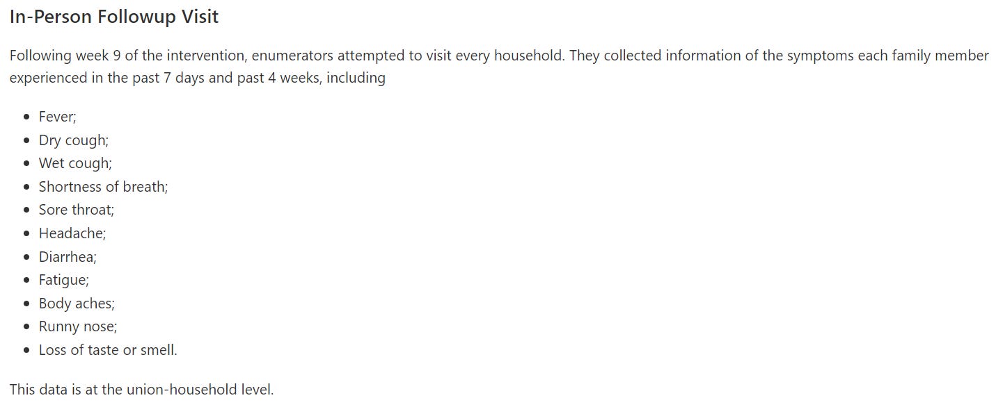
Symptoms were determined by conducting a survey. The survey was conducted in two waves: one at the beginning of week 5, and one at the beginning of week 9. Initially, staff planned to conduct all symptom surveys over the phone, but switched to conducting them in-person when response rates became too low. According to the section “Our intervention reduced WHO COVID-19 symptoms” of the paper, an individual was declared to have “WHO-defined COVID-19 symptoms” if they had met at least one of these three criteria during the past four weeks:
“1) Fever and cough.
2) Any three of the following: fever; cough; general weakness and/or fatigue; headache; muscle aches; sore throat; coryza (nasal congestion or runny nose); dyspnoea (shortness of breath or difficulty breathing); anorexia (loss of appetite), nausea, and/or vomiting; diarrhea; or altered mental status.
3) Anosmia (loss of smell) and ageusia (loss of taste).”
A closer look: Some necessary definitional pedantry
The definition of “WHO-defined COVID-19 symptoms” that the authors say they used is different from the definition they actually used.
Let’s break it down: According to both the symptom survey script from the study plan and the readme for the study data, the researchers collected data on 11 different symptoms. Those symptoms were fever, dry cough, wet cough, shortness of breath, sore throat, headache, diarrhea, fatigue, body aches, runny nose, and loss of taste or smell.
The researchers recorded all survey responses in a data table, which I’ll show you later in Section 2(c). They wrote some code that uses that table to compute who had “WHO-defined COVID-19 symptoms”.
As you can see, the researchers never asked the study participants whether they had anorexia, nausea, vomiting, or altered mental status.
Also, the survey didn’t ask about “muscle aches”, it asked about “muscle or joint pain”. And it asked about “loss of taste or smell”, not “loss of taste and smell”. Finally, a careful reading of the code shows that having a dry cough and a wet cough ticked two boxes toward the three necessary to satisfy criterion 2, not just one box as the paper claims.
In summary, this is what the paper would say if it were an accurate account of what actually happened in Bangladesh:
1) Fever and cough.
2) Any three of the following: fever; coughdry cough; wet cough or sputum/mucus production (so if you had both a dry cough and a wet cough, each is counted separately); general weakness and/or fatigue; headache; muscle or joint painaches; sore throat; coryza (nasal congestion or runny nose); dyspnoea (shortness of breath or difficulty breathing); anorexia (loss of appetite), nausea, and/or vomiting; diarrhea; or altered mental status.
3) Anosmia (loss of smell) andor ageusia (loss of taste).
It seems to me that this error was originally committed out of laziness rather than malice, but the decision not to mention the error in the paper was absolutely a dishonest attempt to maintain credibility (and to avoid admitting the violation of the study’s preregistered analysis plan). Regardless, if you make a big important statement like “Our intervention reduced WHO COVID-19 symptoms”, but can’t even accurately articulate what that means, that certainly does not inspire confidence in your research.
“WHO-defined COVID-19 symptoms” are nonspecific and can easily be reported in the absence of COVID-19 infection. We can see this by referring again to the table below. There were 10,790 symptomatic individuals who consented to a blood test, but only 2192 (20.3%) actually had COVID-19 antibodies.5
This is exacerbated by the fact that the survey did not even confirm that the symptoms occurred simultaneously. For example, if I had a runny nose last Friday, fatigue the Friday before that, and a headache the Friday before that, then I would have “WHO-defined COVID-19 symptoms” by criterion 2.
Even worse, the survey was only given to one respondent per household, who was expected to answer on behalf of all household members. You simply cannot expect most people to give a consistent and accurate accounting of whether or not their sister had a sore throat in the past four weeks.
There are so many factors that could affect the responses to this survey, and there are as many ways that those factors could bias the results toward the intervention (that is, make the symptom rate in the intervention group look lower than it actually was, or make the symptom rate in the control group look higher than it actually was). Here are just a few:
The study was open-label, rather than blinded. That is, participants knew whether they were in the control group or the intervention group. Most of them probably knew the purpose of the study as well, because let’s face it: if you tell 600 villages in Bangladesh you’re doing a study about “how to reduce infectious disease” and aggressively push masks on half of them for months, the entire country is going to be wise to what you’re up to.
When presented with a question they don’t know the answer to (or even a question they do know the answer to), humans have a strong tendency to give the answer they think they’re “supposed to” give. For the control group, that would be “yes, my daughter had a nasal congestion sometime in the last month”. For the intervention group, “no, my daughter did not have a nasal congestion sometime in the last month”. This is a well-known limitation of open-label studies with patient-reported outcomes.
Someone wearing a mask, which they are told will prevent symptoms, is more likely to ignore symptoms when they do occur. They may think, “Did I just cough a little? Oh, it must be nothing, because I’m wearing a mask.” This remark is similar to the famous placebo effect, but crucially different. In the placebo effect, the placebo has a real clinical benefit, whereas here the masks only have an effect on the reporting.
Participants in the intervention group were constantly bombarded with the message that if you get sick, it’s your own damn fault for pulling your mask below your chin for a few minutes that one time, and you’ve put your entire village at risk, oh if only you could have just followed the rules, it’s not like it’s hard, you jerk. If getting sick makes you feel a deep moral shame, you’re less likely to tell a stranger about it on a survey.
Participants in the intervention group may have feared being quarantined, hospitalized, or ostracized if they admitted to having experienced symptoms. Or they may have habitually hidden their symptoms because they had recently been immersed in a culture where admitting your symptoms gets you quarantined, hospitalized, or ostracized.
The in-person symptom surveys lacked blind outcome assessment. That is, the staff conducting them knew whether they were interviewing someone in the control group or the intervention group. You really can’t let someone with an interest in the results conduct a subjective survey such as this one. If I ask you “Did anyone in your household have fatigue or malaise in the past four weeks?”, and you ask me to clarify the question because it’s vague or because your English is rusty, you can bet that my response is going to depend on whether I want you to answer “yes” or “no”.
And remember, we’re looking at an absolute difference of less than one percent in symptom reporting rates between the control group and intervention group. Ask yourself whether the biases listed above can explain that difference.
Is this bias theoretical or actual?
Okay, so there are a ton of ways that the survey could have injected bias into the study. But did it actually?
I shouldn’t even need to ask this question. The authors should already have discussed it at length in the paper and made an honest attempt to correct for it. Instead, all we get is two measly sentences in the “Study limitations” section that do not even come close to explaining the extent of the potential problem:
“[S]urvey respondents could have changed their likelihood of reporting symptoms in places where mask-wearing was more widespread. If respondents were more cognizant of symptoms in mask-wearing areas, this may bias us toward underestimating the impact of masks; if respondents in mask-wearing areas were less concerned with mild symptoms and thus were less likely to recall them, this might bias us toward overestimating the impact of masks.”
As long as I do need to ask this question, though, let me answer it as well: Based on the data, it sure looks like it did.
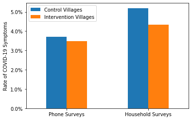
The survey medium shouldn’t have mattered, but it did
First, if the survey results really were reliable, then the intervention should be as effective whether you asked someone about their symptoms using a phone survey or an household survey. On the other hand, if the survey results were biased in the ways described above, then the intervention would appear more effective in the household surveys than in the phone surveys. The tendency to give the “correct” answer, the moral shame of admitting to having been sick, and the fear of being ostracized are all higher when the researcher is actually at your doorstep. So is the ability for that researcher to consciously or unconsciously influence the survey to get the answers they want.
Here is a graph demonstrating the comparison. Each blue (respectively, orange) bar represents the proportion of individuals in the control group (respectively, the intervention group) who had “WHO-defined COVID-19 symptoms” according to one particular type of survey. For example, the leftmost orange bar indicates that about 3.5% of individuals in the intervention group reported symptoms in a phone survey.
As you can see, the intervention was significantly more effective if you asked people about their symptoms in person rather than over the phone.
It should also be noted that more “WHO-defined COVID-19 symptoms” were reported in the household surveys than in the phone surveys, even though there were fewer household surveys overall (287,163 vs. 292,831) and those household surveys were carried out at a time of lower COVID-19 prevalence (see the graphs from Our World in Data below).
The intervention worked less well against more “objective” symptoms
Rather than merely asking how well the intervention prevented “WHO-defined COVID symptoms”, we can also more specifically examine how well the intervention prevented each individual symptom in the survey. In the graph below, each blue bar represents the rate of a particular symptom in the control group, and each orange bar represents the rate of a particular symptom in the intervention group. For each symptom, we can look at the difference between the orange and blue bars to see how “effective” the intervention was at reducing rates of that symptom.
There’s a lot of data here, and probably many possible conclusions, but what jumps out to me personally is this: The more you need to think to answer the question “Did you experience X in the past four weeks?”, the more the intervention reduced the rates of X.
The intervention seems to have been very effective against headache, fatigue or malaise, and body aches (muscle or joint pain). These symptoms are relatively common even outside of a pandemic; so common that you might not even remember that you, or someone you live with, had them. They have wild variations in severity: even if you do remember having a headache, if it was mild enough, you might not say “yes” when someone asks you.
That means there’s a lot of room for your answer to depend on the answer expected of you, or your perception of your COVID risk, or the masked death stare of the researcher asking you the question, or all the other pernicious factors we’ve discussed. These were also the three most reported symptoms overall, so they probably contributed a great deal to the overall rate of “WHO-defined COVID-19 symptoms”.
The intervention seems to have been considerably less effective (in both a relative and absolute sense) against wet cough or sputum/mucus production, diarrhea, runny nose or nasal congestion, and loss of taste or smell. These symptoms are more specific to COVID-19, and it’s considerably harder to forget them or to remember having them when you didn’t. It’s still not impossible, especially when you’re asked 11 rapid-fire questions in a row and have to answer for everyone in your household, but it’s harder.
There is still some potential for bias when asking about these symptoms, but it’s greatly reduced. And I think that’s why the intervention was so much less effective on them. Of course, these symptoms were also rare enough that the intervention didn’t need to work on them to still show a strong benefit on “WHO-defined COVID-19 symptoms” as a whole.
Overall, we’d better not put too much stock into the results of these symptom surveys. Not only are there many potential ways that bias could have crept in, but those ways appear to have been borne out in the data.
I hesitate to say the survey was a non-starter, but it should have been made significantly more robust. Developing patient-reported outcomes for randomized controlled trials is hard and there are entire journals dedicated to how to do it properly. It’s not surprising that you don’t get reliable data if you just lift your survey from a list of vague symptoms and only give it every four weeks, to only one person per household, in a language that many patients are not fluent in.
2(c). Symptomatic seropositivity, as defined in the study, is a poor surrogate endpoint
Recall that the primary endpoint of the study was not the symptom survey alone, but rather “symptomatic seropositivity”, defined by meeting all three of the following conditions:
Exhibiting COVID-19 symptoms, as determined by a survey.
Consenting to blood collection at endline.
Having IgG antibodies against SARS-CoV-2 detected in the blood serum.
Symptomatic seropositivity is an example of a surrogate endpoint. We really want to know whether the intervention had any effect on symptomatic infection during the study period, not whether it had any effect on symptomatic seropositivity.
It is possible for someone to be symptomatically seropositive but not have been symptomatically infected during the study period. They would merely need to respond to the survey that they had symptoms, consent to blood collection, and have IgG antibodies left over from a previous SARS-CoV-2 infection, symptomatic or asymptomatic.
Conversely, it is possible for someone to have been symptomatically infected during the study period but not be symptomatically seropositive. They would merely need to respond to the survey that they did not have symptoms or refuse to have their blood collected. (And a lot of people refused to have their blood collected. Consent rate for blood collection was only 40%.)
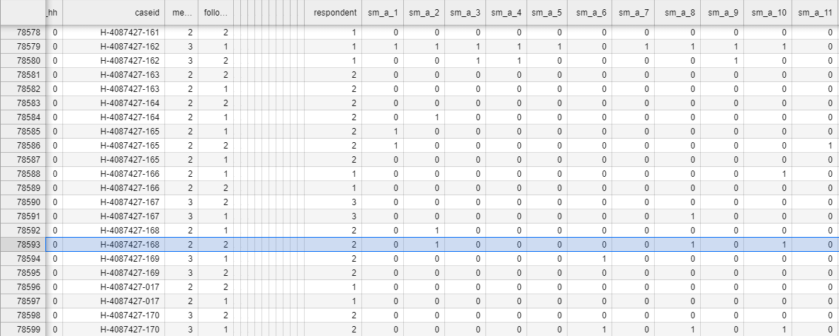
Did H-4087427-168-1 actually have COVID?
To illustrate, I randomly sampled three symptomatically seropositive individuals from the study data to see how they responded to the symptom survey. Here’s the survey responses from household H-4087427-168, which had a symptomatically seropositive member H-4087427-168-1 (obviously, the names have been anonymized):
This is difficult to read, but I’ll walk you through it. Each row of this table represents one time that the phone survey was given to a household.
The number in column sm_a_1 is the answer the household gave to the question “Has anyone in your household experienced a fever in the last four weeks?”, with a “yes” answer entered as “1” and a “no” answer entered as “0”.
Column sm_a_2 is the answer to the question “Has anyone in your household experienced a dry cough in the last four weeks?”, where, again, 1 means “yes” and 0 means “no”.
Column sm_a_3: “Has anyone in your household experienced a wet cough or sputum/mucus production in the last four weeks?”
Column sm_a_4: “Shortness of breath or difficulty breathing?”
Column sm_a_5: “Sore throat?”
Column sm_a_6: “Headache?”
Column sm_a_7: “Diarrhea?”
Column sm_a_8: “Fatigue or malaise?”
Column sm_a_9: “Body aches (muscle or joint pain)?”
Column sm_a_10: “Runny nose or nasal congestion?”
Column sm_a_11: “Loss of taste or smell?”
Reading down the highlighted row, we see that the numbers in sm_a_2, sm_a_8, and sm_a_10 are 1 and the rest are 0. That means H-4087427-168-1 had experienced a dry cough, fatigue / malaise, and runny nose / nasal congestion, all within a four week period, but not necessarily all at the same time. She did not experience fever, wet cough or sputum / mucus production, shortness of breath / difficulty breathing, sore throat, headache, diarrhea, body aches / muscle or joint pain, or loss of taste or smell.
Now, I’m not a doctor, but I wouldn’t be so confident that this patient had actually had COVID-19 in the last four weeks. She is missing most of the important symptoms, and the ones she did report are highly nonspecific. It is possible, even likely, that the blood test just picked up antibodies from before the study. This is why you need to perform an active test, like a nasal swab PCR test, shortly after symptom onset to properly diagnose the disease.
H-4087427-168-1 is not alone
So, symptomatic seropositivity is definitely not a perfect indicator of symptomatic infection during the study period. But how good an indicator is it?
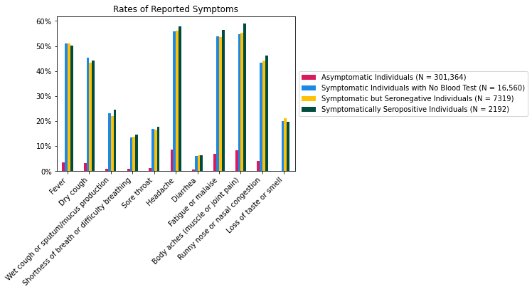
To get a sense of that, let’s restrict our attention to the 327,435 individuals in the 572 villages in which blood tests were performed. These individuals fall into four groups:
301,364 asymptomatic individuals; that is, individuals who did not have “WHO-defined COVID-19 symptoms” according to their survey responses.
16,560 individuals who were symptomatic, but did not have their blood tested, either because they did not consent to having their blood collected or because of errors. From the subsection “Sample selection” of the paper:
“Untested samples (<12%) either lacked sufficient quantity for our test or could not be matched to individuals from our sample because of a barcode scanning error.”
7319 symptomatic individuals who had their blood tested, but were found to be seronegative; i.e. not to have had IgG antibodies for SARS-CoV-2.
2192 symptomatically seropositive individuals.
In each group, we can plot what proportion of individuals reported having had a fever sometime during the eight-week study period. We can do the same for the other 10 symptoms queried in the survey.
Let me remind you that each bar in the above plot represents the rate of a symptom within one of the four groups. So, for example, the leftmost yellow bar indicates that among the 7319 symptomatic but seronegative individuals, about half (more precisely, 50.9%) of them had a fever. It does not indicate that among the individuals who had a fever, about half of them were symptomatic but seronegative. Make sure you understand the difference.
As you can see, the symptomatic but seronegative individuals reported each symptom at approximately the same rate as the symptomatically seropositive individuals. In other words, knowing that someone had a particular symptom only barely helps you predict the outcome of their blood test. Remarkably, this even applies to loss of taste or smell, which is often considered to be a telltale sign of COVID-19. In fact, comparing the rightmost yellow and green bars, we see that the rate of loss of taste or smell in the symptomatic but seronegative group (21.2%) was higher than the rate of loss of taste or smell in the symptomatically seropositive group (19.8%). Equivalently, among symptomatic individuals with a blood test, those who reported loss of taste or smell were slightly less likely to test seropositive than those who did not report it.
This is a sure sign that IgG antibodies from prior infection or asymptomatic infection have heavily influenced the symptomatic seropositivity rates. That is bad news for this study, because if you have prior IgG antibodies and you’re okay with your blood being collected, then whether you’re counted as symptomatically seropositive depends almost exclusively on how you responded to the symptom surveys, which I have already argued are highly prone to bias.
Where did these prior IgG antibodies come from?
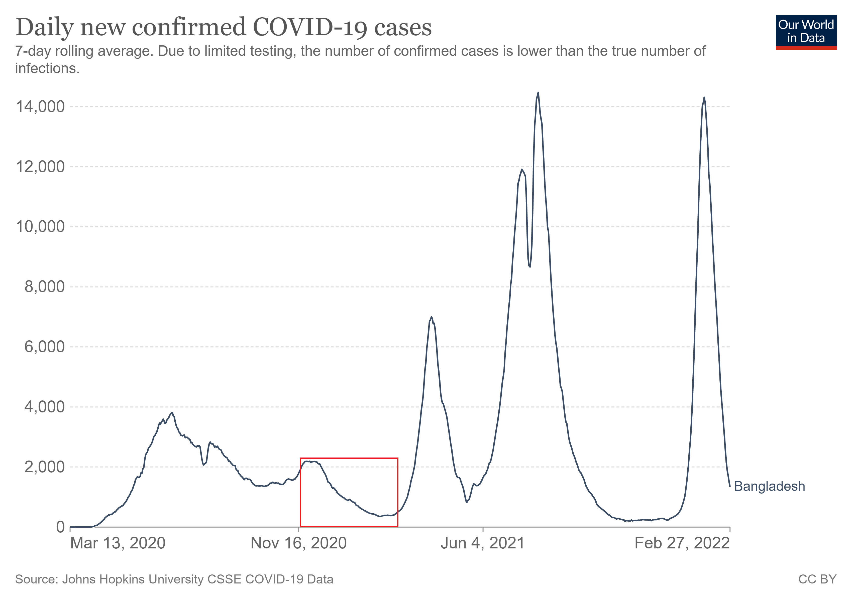
How could this have happened? We can get a clue by examining the timeline of the study. According to the subsection “Sampling frame and timeline”, the intervention was applied in different villages at different times. Each village was part of one of seven “waves”. The villages in wave 1 started the study on November 17–18, 2020. Each subsequent wave started one week later than the previous, so the villages in wave 7 started on January 5–6, 2021. The intervention was applied over a period of eight weeks in each village, and that time period of eight weeks was the subject of the symptom surveys.
In total, the surveys asked about symptoms that occurred from November 17 to March 3 (eight weeks after January 6).
Here is a graph of COVID-19 case history in Bangladesh from Our World in Data. The red box represents the time period covered by the symptom surveys. We see that the study was performed after the first major COVID-19 wave in Bangladesh, during a time of relatively low prevalence. That comports with the hypothesis that antibodies found in a person’s blood are likely to have been left over from a previous infection.
Comparing symptomatic seropositive cases to COVID-19 cases
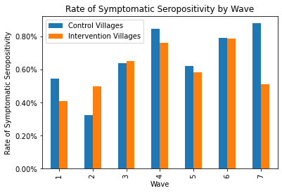
The Our World in Data graph reveals something else as well: COVID cases were consistently decreasing in Bangladesh during the study. (Keep in mind that Bangladesh is a rather small country, so case trajectories would have been roughly the same throughout.) If symptomatic seropositivity really were a good indicator of COVID-19 infection, then the villages in wave 1 would have had much more symptomatic seropositivity than the villages in wave 7. But as you can see in the bar graph below, they didn’t. The rates in wave 1 were actually lower than the rates in week 7. (In this graph, I also split the data up into control villages and intervention villages so you can see how effective the intervention was in each wave.6)
In summary, a positive result on your endline blood test is a poor indicator of whether you actually had COVID-19 during the eight-week study period. “Symptomatic seropositivity” is a dreadfully noisy, inaccurate, and biased endpoint. And we only know that the intervention had an effect on symptomatic seropositivity. We don’t know whether it had any effect on actual COVID outcomes.
3. Summary and conclusion
This study fails to actually isolate the effects of mask-wearing. Moreover, it is based on vague and bias-prone symptom surveys that are incorrectly documented in the paper, and on blood tests which seem to have been an incredibly poor way to diagnose whether someone was infected during the study. I’ve been analyzing this study for months, and it seems the more I do so, the more thoroughly it falls apart.
In my opinion, the flaws I’ve already pointed out are more than sufficient to discard the study. I could stop here, but I have a lot more to say. Look out for part 1(b), where we will wonder whether red cloth masks are better than blue surgical masks, ponder what the study really proves about risk compensation, investigate the balance of the control and intervention groups, and reveal never-before-seen email exchanges with the authors of the paper.
Dr. Abaluck claimed on the Accad and Koka Report that these numbers are in the paper, and that even if they weren’t, they could be computed by multiplying together numbers from the abstract anyway. Well, I’m not seeing them, and no multiplication I do is yielding the right numbers. I’d be happy to be proven wrong.
Frankly, I feel sorry for the Bangladeshis in the intervention group who had to suffer the relentless badgering, condescension, and self-righteousness of out-of-touch Americans. The moralizing and shaming on display in this intervention is a real and serious problem for pandemic policy at large.
There is a stunning lack of public health ethics in the scripts the staff used. Of the scripts that Google Drive lets me access, the mosque script is the worst, with such bangers as:
“When you do not wear a mask over your nose and mouth especially when talking to another person, that means that you might be passing coronavirus to them and making them sick. [SHOW “RESPECTFUL/DISRESPECTFUL” LEAFLET] In this way, when you do not wear a mask around another person, it can be a sign of disrespect and disregard for that person’s health. People will feel ashamed if they cause another person to get sick.”
(The script, which is a read-only Google Doc, has some information about Omicron and KF-94’s, so it was certainly edited after the study ended, probably to be used in a follow-up study. But it is linked in the study protocol, so it is probably at the very least similar to the script they actually used. And the other public scripts, which don’t appear to have been edited, contain similar language.)
Haven’t they seen what the WHO wrote in their document “Social Stigma associated with COVID-19”? Or did they think they were in the clear because they used the word “passing” instead of “transmitting”?
The study staff were probably surprised and disappointed that the intervention villages had “only” a 42.27% mask-wearing rate. “How could they not do what we say? Is it because we didn’t do enough emotional blackmail?” No, it’s because you did too much emotional blackmail, and people don’t trust you anymore.
I understand that doing good science sometimes involves hurting people’s feelings. But this is totally unnecessary, and I strongly get the impression that the researchers didn’t even consider that they might be doing anything wrong.
I am not claiming that it was really the physical distancing that caused the decrease in COVID-19 symptoms, by the way. In fact, the study authors specifically deny any association between physical distancing and symptoms in Appendix O:
“Once we control for mask-wearing, we see no significant relationship between physical distancing and symptomatic seropositivity.”
Compare this 20.3% figure to the numbers from “Seroprevalence of SARS-CoV-2 antibodies in Bangladesh related to novel coronavirus infection”. In October 2020, approximately 36% of the population of Bangladesh, and 29% of the rural population of Bangladesh, had IgG antibodies for SARS-CoV-2. (Seropositivity rates were even higher in adults, which include all the participants of the Bangladesh mask study.) Remarkably, 20.3% is less than 29%.
I know that the endline blood tests in the Bangladesh mask study occurred quite a bit later than October 2020, but IgG antibodies last a fairly long time. And I would expect a rural Bangladeshi who reported having COVID-19 symptoms to be much more likely to test positive for SARS-CoV-2 antibodies than a random rural Bangladeshi. Alas, this seems not to have been the case. This is yet another indication of the survey’s unreliability.
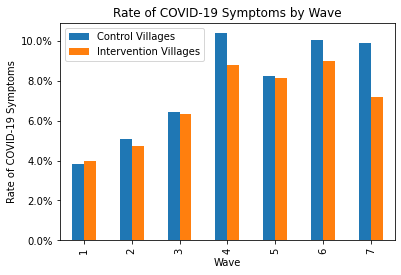
And for good measure, here are the responses to the symptom surveys by wave. It is worth noting that in waves 1–3, all symptom surveys were conducted over the phone; the in-person surveys only started in waves 4–7.
1) We have to consider Jason Abaluck was predisposed to finding a confirmation of his bias. I'm sure he's a smart guy, but he was not neutral, and that would potentially impact how he reads the tea leaves. He authored a widely shared plea to mask up immediately when Covid hysteria appeared in April of 2020 calling upon the precautionary principle. https://papers.ssrn.com/sol3/papers.cfm?abstract_id=3567438
2) The ARR is so small that you have to wonder how? If masks did nothing there would still be a 50/50 shot a random study happened to have more infections in the control. I would have expected a bigger ARR swing just by randomness. The fact that the ARR is below even the placebo level suggests a chance of negative efficacy - especially if you control for the increased distancing.


Excellent review. Quick notes/questions:
1) We have to consider Jason Abaluck was predisposed to finding a confirmation of his bias. I'm sure he's a smart guy, but he was not neutral, and that would potentially impact how he reads the tea leaves. He authored a widely shared plea to mask up immediately when Covid hysteria appeared in April of 2020 calling upon the precautionary principle. https://papers.ssrn.com/sol3/papers.cfm?abstract_id=3567438
2) The ARR is so small that you have to wonder how? If masks did nothing there would still be a 50/50 shot a random study happened to have more infections in the control. I would have expected a bigger ARR swing just by randomness. The fact that the ARR is below even the placebo level suggests a chance of negative efficacy - especially if you control for the increased distancing.
3) We could have easily blinded it. Give half the villagers these. Never know the difference. https://fakemaskworldwide.com/the-fake-surgical-mask-2-layer/
4) 2/9ths of the sick people weren't sick with Covid.... why not chase down the other 7/9th with such vigor?
5) ML: “Did H-4087427-168-1 actually have COVID?” - << Really impressive you dug that deep!
6) “How could they not do what we say? Is it because we didn’t do enough emotional blackmail?
- Did they really say this?